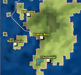
I know that I said last week that I wasn't going to have much time for game development for the week, and to not expect many updates. The truth is, I found more time than I thought I would have, and ended up doing quite a bit with that time. This is the latest version of what I have.
I'm still playing with the clouds in particular, I have a few things in mind, will see how they work out. This is still an early test, so let me know what you think!
I also changed the way the wind is shown on the graph. It's still slower than I would like, I'm trying to figure out how to improve that, but it is much more visible, and I'm happy with the direction it is going. Along with that, I started using more realistic wind patterns, basically I set up the trade winds, with a bit of noise.
It can be seen on both of the previous images, but I've been working on bitmasking, basically making the land not look so smooth. Here's a closer up picture to show how it looks. I totally scrapped the system from last week, and went with a shader based approach, which I document exactly how I did it on the Game Development Stack Exchange.
Movement is no longer easy to do diagonally if both primary directions have land. As there isn't a visible gap between them, it seemed the appropriate thing to do.
I also fixed a bunch of small things, too many and small to enumerate them all. Sufficeth to say the game is better than before.
The way I generated the biomes allows for a slight seasonal variation, although I don't think the seasonal variation is quite what it should be. I'm working on how to make it work best still, but it should be cool when I can get it worked out. It's a task for this week, but lower priority.
This week I'm planning to get the other half of biome creation figured out, namely getting the moisture part done. When I'm finished, we should have something like deserts being formed, which should look really cool if I can get it all figured out! Beyond that will be numerous speed improvements, the game doesn't work as well as I'd like when fully zoomed out. I'm also trying to work out a more seamless noise, there are still visible seams if you know where to look.
Thanks to Jon Gallant, BTW, for his tutorial on world creation, which I used in some part to complete. He's got some great games, including one in the work called GORB that I'll highly recommend when complete.


Hey, this looks really interesting, i would suggest some GUI changes, first the clouds look good, but out of place cause you are using a "realistic" aproach on a world made out of squares try making the clouds squares as well keep the realistic effect but make them look like squares and check out how it looks, also the color pallete looks a bit dull try using adobe color webpage to find a better combination that makes pop out things.
ReplyDeleteThe arrows of the wind direction are the ones that i see as a big problem for what you show the info they give is a bit messy and looks over complicated for a user, but mm i think you should try thicker arrows with better contrast and if there are 3 arrows that point on one way, instead of making 3 arrows make 2 lines and 1 arrow at the end basically do that when the wind direction breaks into a new one, that way the user can read the info better.
Thanks for the feedback. I do intend to add more variety to the color pallet, which should help, hopefully in the next few weeks I'll be done to the point where I can get that checked out as well.
DeleteAs for the arrows, thanks for the feedback there as well. I'm in the process of re-working the arrows, mostly because it just takes too long to display, I'll take your feedback while I'm working on it. That should help the visibility.
As for the clouds, I'll consider it. Right now that's a pretty early effect, but I could certainly play around with it. The reason why I'm doing a square tile based system is because it makes the math easier, world generation, storage, etc. As the clouds are there just for effect, I can leave them as more realistic without too many issues. Still, I'll play around with it, thanks for the ideas.
Just a tip for the color, dont focus on variety as much as in harmony an harmonic color palette can do wonders, but i guess thats stuff for after the programming works like a charm, im actually curious of playing your game.
DeleteGood suggest, I'll look into it some more. Playing the game involves taking a ship from port to port and either taking missions or buying/selling goods, keeping your ship stocked, and generally just trying to become rich by sea trading. I'll have things eventually like pirates too that you need to try and stay alive with other stuff happening.
Delete